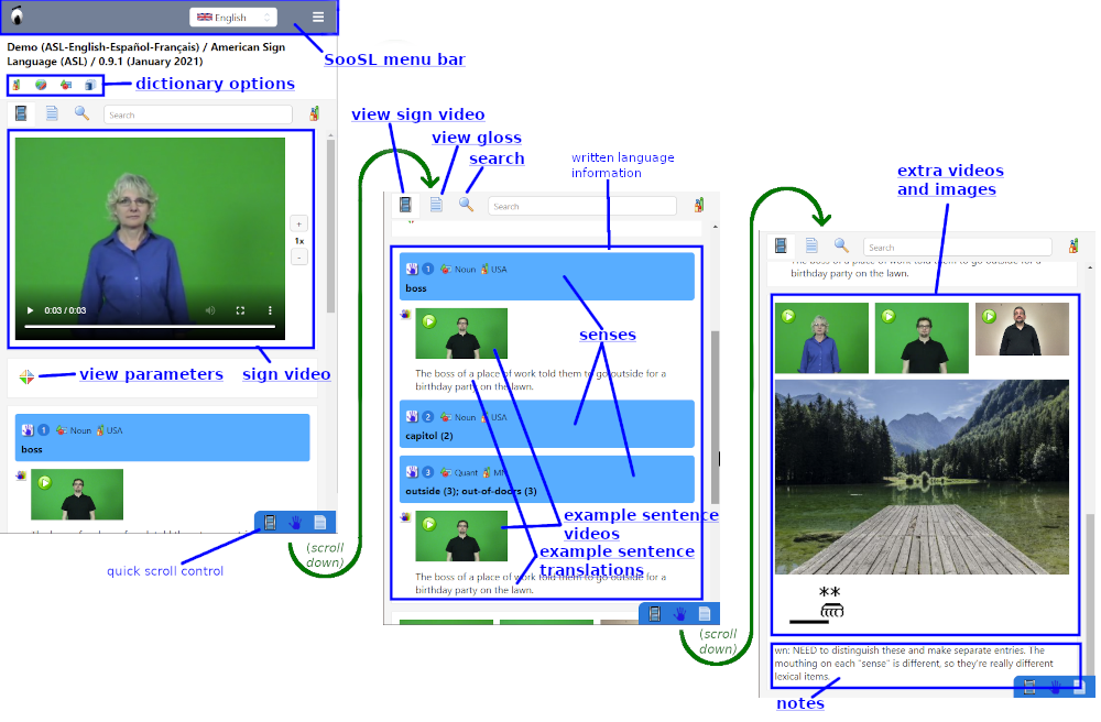
In SooSL Web, Normal mode comes in three variations, depending on the width of your screen. It looks different on a smartphone, a tablet, and a computer. You may see 1, 2, or 3 columns.
Smartphones usually show just one long narrow column. You can scroll down to see all the different parts of a dictionary entry. Use the quick scroll control to quickly scroll to a particular type of information.
The blue outlines show the main sections of the screen. Click in a section or on its underlined label below to learn more about it.
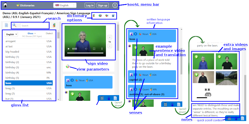
Tablets and smartphones held horizontally show two columns. You can see the gloss list all the time in the first column. The second column looks and works a lot like the 1-column display above.
The blue outlines show the main sections of the screen. Click in a section or on its underlined label below to learn more about it.
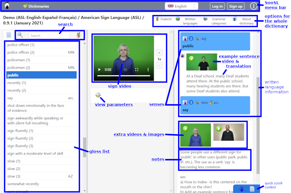
Computers usually show SooSL Web in three columns. These columns look a lot like SooSL Desktop.
The blue outlines show the main sections of the screen. Click in a section or on its underlined label below to learn more about it.
On a computer, you can also make the whole SooSL window narrower, and it will switch to 1 or 2 columns.
On the 2-column and 3-column displays, you can change the widths of the columns. Click and drag a column divider. On a touchscreen, press on the divider and slide it.
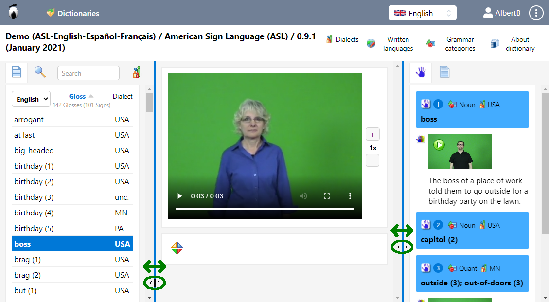
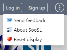
If you don't like the results, you can reset the column widths from the menu in the top right. Choose ![]() Reset display.
Reset display.
Created with the Personal Edition of HelpNDoc: Powerful and User-Friendly Help Authoring Tool for Markdown Documents